Recurred: shipping my first SwiftUI app to the App Store.
I track around 40 subscriptions in 5 different currencies. Before I wrote a line of code, I installed a dozen subscription trackers and deleted every one of them.
Some had most of the features I wanted and stopped right where it got interesting. A couple were beautiful and did almost nothing. And most of them wanted a monthly payment, which is a strange thing to ask of someone installing an app to get their monthly payments under control.
So I built my own. It's called Recurred, it's free, it's on the App Store, and this post is about the parts that turned out to be harder than the code.
Most people track the tip of the iceberg.
Ask someone what they're subscribed to and you'll hear Netflix, Spotify, maybe a gym they stopped visiting in February. Entertainment. That's the category almost every app in this space is built around, and it's a thin slice of what actually leaves your account.
My list looks different: mobile plan, home internet, domain renewals, cloud storage, a few dev tools, a couple of AI subscriptions, a food delivery pass (Wolt, Glovo, whichever one is cheapest that season), insurance billed once a year. None of that is entertainment. All of it renews on its own schedule whether or not I remember it exists.
The yearly view is where it gets uncomfortable. A $12 monthly thing is $144 a year, and nobody cancels a $12 thing. A dozen of them is a flight home. I wanted an app that showed me the year instead of the month, and folded five currencies into one number without me maintaining a spreadsheet. (I had the spreadsheet. The spreadsheet was worse.)
I wrote a while back about how the frame you look at money through decides what you do next. Same trap here, smaller stakes. Monthly framing makes every line look harmless. Nothing looks harmless once you multiply it by twelve.
The proof of concept was the fun part.
I had a working proof of concept in November 2025. Subscriptions in, calendar out, currency math in the middle. On my own phone it looked finished.
Then I didn't touch it until the middle of June 2026.
I was busy, sure, but that's not the honest answer. The honest answer is that I knew what came next. A proof of concept is the stretch where every hour of work shows up on screen. Everything after it is a full day spent on an empty state that nobody will ever compliment you on.
Tom Cargill's ninety-ninety rule covers it better than I can: the first 90% of the code takes the first 90% of the time, and the remaining 10% takes the other 90%. The demo is where the fun lives. The product is where the shipping lives.
Here's the catch, and it's the only piece of wisdom in this post. That boring second 90% is the part that decides whether the thing exists at all. Onboarding, settings, empty and error states, iCloud sync conflicts, notification permissions and scheduling, Dynamic Type at the largest sizes, VoiceOver labels on charts, an icon, screenshots, a privacy page, a support page, store copy. None of it demos well. All of it is the app.
Once I sat back down in June, it moved. I submitted, and it was approved on the first try on 22 July 2026. I had mentally budgeted a month of arguing with Apple and got none of it. I suspect the reason is boring: no account, no tracking, no purchases, nothing for a reviewer to poke at.
The waiting was a different story. That first submission spent about six days in review, and almost all of it was queue rather than anyone looking at my app. Every update since has come back in 7 to 10 hours. Apple says 24 to 48 hours; that has not matched my experience for a new app, and judging by what developers post, plenty of them wait far longer on updates too. Budget for the queue, not for the review.
What it does.
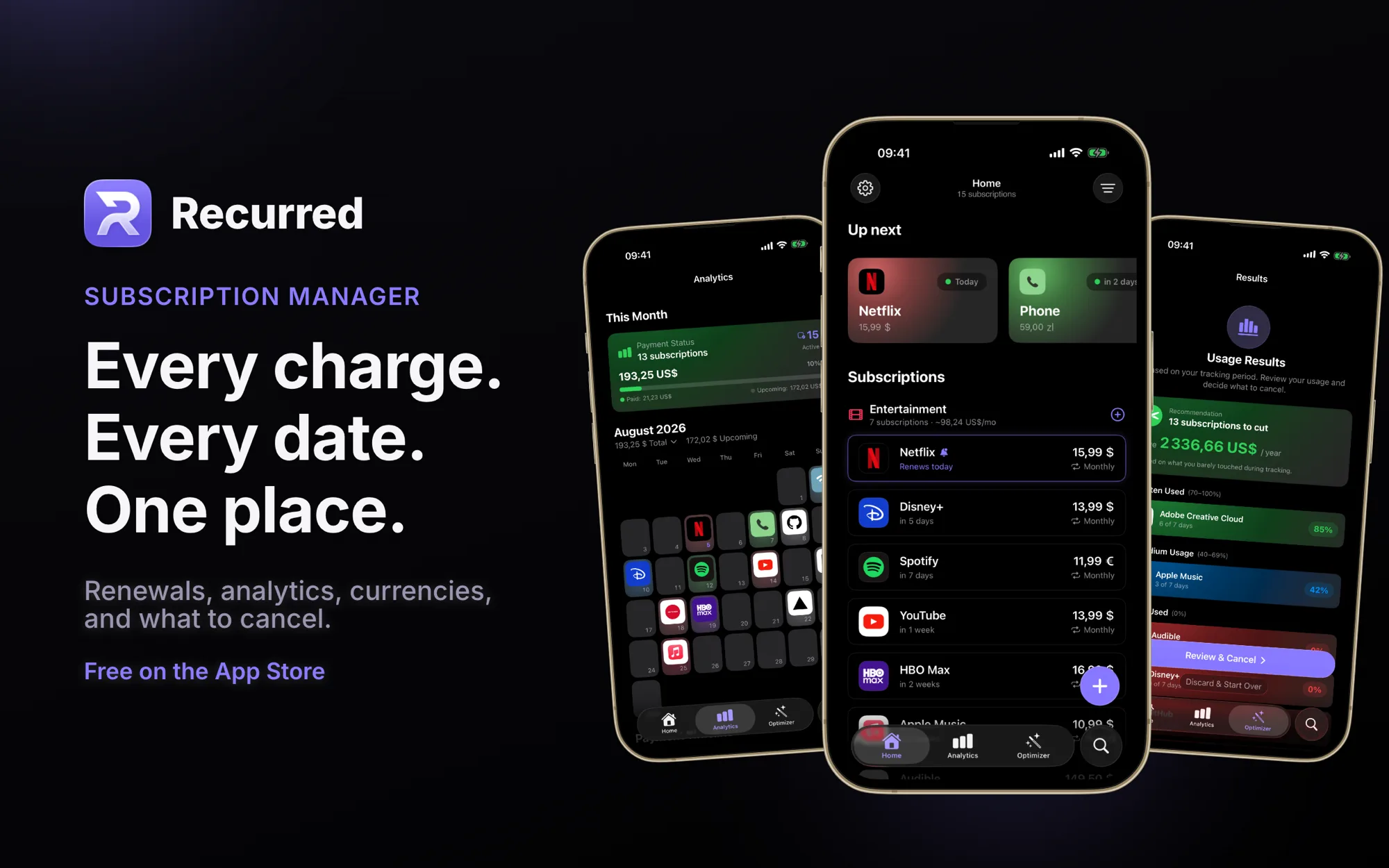
- Every renewal on a calendar, with reminders before a charge lands or a free trial converts, at the lead time and hour you choose.
- Each subscription tracked in the currency you're billed in, with one combined total in yours and rates kept current. Tap the foreign amount on a subscription and it converts to your base currency right there.
- An Optimizer that tracks how often you open each service over a period, then tells you what to cut and what a year of it costs.
- Breakdowns by category and month, top spenders, and a 3-year payment timeline built from what you paid and not from today's price.
- Price history, so those "small" increases stop being invisible.
- Two home screen widgets: what's about to land, and how this month compares to a normal one.
- Hundreds of services with logos to pick from, plain-English entry processed on device (on Apple Intelligence capable hardware), and CSV import if you're coming from a spreadsheet.
- Data stays on your device and syncs through your own iCloud. No account, no ads, no analytics, everything unlocked, free.
That last point is not a growth strategy. It's a constraint I gave myself on day one: an app that nags you about subscriptions has no business being one. There is no subscription and there won't be one, and everything that's free today stays free.
Why me. I don't consider myself a mobile developer.
Three reasons, in order of honesty.
The first is that I wanted it. I'm a professional spender on subscriptions, and after a dozen apps I still didn't have one I liked. The features I needed existed, just scattered across different apps, one calendar here, one decent breakdown there. I used a few of them for a while and was never happy. What every single one had in common was a payment screen.
The second is that I'd never done it. I've written more languages than I put on my CV, Go and NodeJS and Rust among them, and all of it went into web projects, services and backends. Never a native mobile app. Wrapping a web view would have skipped the entire lesson, so it's Swift and SwiftUI top to bottom.
The third is work. I lead a team at a bank with native mobile apps, and reviewing mobile pull requests without having shipped a mobile app is a thin position to argue from. You can follow the code and still miss what's risky about it. Building my own moved that further in a few months than reading ever did.
The odd part is where it transferred. Swift and Kotlin have close to nothing in common, and yet I started reading our Kotlin code more comfortably after a few months of Swift. My teammates have probably noticed. I don't have a clean explanation for it, but a mobile app has its own shape, and once you've fought that shape yourself the language stops being the hard part.
No Android version is planned. One person, one ecosystem, done properly.
iPad was the easy one. macOS is not.
The iPad version went out recently and it was mostly a layout problem. Subscriptions and their details side by side, every screen working in landscape, sort and group as a popover instead of a takeover. Wider screen, bigger cards, roomier charts. SwiftUI handled most of it once I stopped assuming a phone.
macOS is where the promise gets tested. SwiftUI is sold as one framework across Apple platforms, and that holds right up until you want the app to feel like it belongs on a Mac. Screens want to be windows. Sheets want to be panels. The menu bar exists and expects to be filled. Keyboard shortcuts and hover states stop being optional. The window resizes to shapes no phone has ever been. And a pile of iOS habits quietly stop applying.
SwiftUI is one framework. It is not one app.
I'm working through that now. Until it's done, Recurred runs on Apple silicon Macs as a Designed for iPad app. It launches, it works, and it looks exactly like what it is: an iPad app in a window, minus the animations and the small nice touches that this format quietly strips away from Mac users. If you want to run the unpolished version today, it's already there.
The only server is Go.
One piece of this lives outside your device: a small Go service that keeps exchange rates fresh. Old habits, and this blog isn't going to stop being mostly Go.
It pulls from six different rate providers with a cache in front, so one of them going down or going weird doesn't take the app's totals with it. These aren't live rates and there's no history, just yesterday's close. For deciding whether your subscriptions cost too much, yesterday is plenty.
Everything else, storage, sync, notifications, the on-device parsing, happens on the phone.
Wrapping up.
If you track more than a handful of recurring payments, count the ones that aren't entertainment first. That's usually where the money is.
And if you have a proof of concept sitting in a folder since last year, the thing standing between it and a product isn't a hard problem. It's a list of unglamorous ones. I put mine off for six months and it turned out the finishing work took about the same time as the fun part did.
- Recurred: gozman.space/apps/recurred
- App Store: apps.apple.com/app/id6783705092
See you in the next post 👾
8 Aug
2026